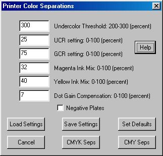
CMYK Plate Separation Dialog
| Quick Nav Bar | ||||||||
|---|---|---|---|---|---|---|---|---|
| << Previous | Contents |
Selection |
Op Index |
Parent | User Notes |
Index |
Glossary |
Next >> |
|
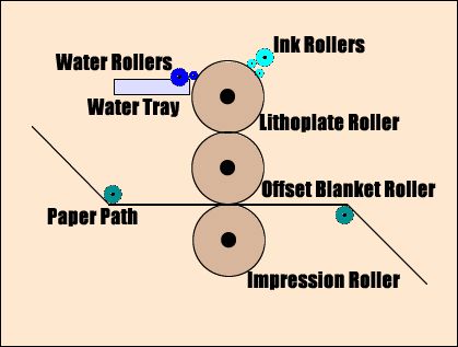
So it is that four "monochrome" files that contain images which carry intensity information that describes how much to use of each of the cyan, magenta, yellow and black inks are provided to the printer. Then the printer "screens" or "halftones" the density information into dots that can easily be printed. Finally, these dots are placed on a metal plate (the Lithoplate Roller), which, through a really neat mechanical process involving other rollers, ink, water and even knives, creates a reproduction of the picture from your original RGB image.
It's really fun to watch - if you ever get a chance, try to visit your print shop (but warn them first!)
That's the basic process. But it's not really that simple, because the CMY ink colors aren't as "pure" as the colors in the channels, because the inks interfere with each other on the paper, because the colored inks don't make very good blacks when combined in equal amounts, and because each of the components: the paper, the ink, the press that prints the ink to the paper, and how the subject matter of the images is turned into "dots" (screening or halftoning) all affect the output. Whew!
All of this means that the objective of creating high quality color separation plates intended to be used on an offset press can only be reached by accomodating all of these factors, and more. And that's what all that "stuff" in the dialog is there to help you do.
Any good print shop should be able to give you the facts and figures you need to set up WinImages F/x to give you fabulous results. WinImages F/x provides the settings you really need to control the parts of the process you as the image creator are responsible for, and allows you to save your separations in any image format you like, which means the output files can be made to be compatible with almost any print shop. Then they can do the part of the job that they are responsible for well.
If you use an image of less than DPI = 1.5 times the screen frequency, you'll begin to see "stair-stepping" on the edges of elements of the image. If you use an image with a higher resolution than DPI = 2 times the screen frequency, you'll begin to lose pixels - some won't show up on the output plate at all.
DPI is literally "Dots Per Inch". So if you know you'll need 200 dpi, and you want the image to cover an area three inches across, you'll need an image that is 600 pixels wide. The math to figure this out is easy enough - just multiply the DPI times the number of inches you want to cover.
The actual screen frequency can vary widely, depending on what you're trying to print. Talk to your print shop about what would work best for what you're attempting.
Image and Bleed Areas
You need to remain aware at all times of what parts of the image are meant to go on the paper, and what parts will be cut off. If you expect to "print right up to the edges of the paper", then you need to talk to the printer about the amount of the image you'll need to provide in this bleed area.
|
UCR is a process by which black ink (the K channel) is used to darken areas that are either grayscale, or where colors are fairly neutral. This works well for images that need to keep a tight rein on grayscale values.
GCR, in contrast (pun intended), uses more black ink on colors that are not neutral. This tends to work better for images that have dark colors that are nonetheless quite pure - they seem richer and more vivid with a GCR separation.
WinImages F/x allows you to use either, or both(!) processes; but you need to talk to your print shop and see what they suggest. The choice between the two is also affected by the inks in use, the paper that the image will be printed on, and perhaps limitations of the print shop - some will definitely get better end results with the process they suggest.
|
Remember, for the Undercolor Threshold to be applied, you must use UCR.
Cyan (blue) inks contain trace amounts of magenta pigments, and magenta inks contain trace amounts of yellow pigments. Professional yellow printing inks, however, are quite pure and do not require compensation.
WinImages F/x's printing separation allows you to compensate for the impurities in the cyan and magenta inks. As usual, you'll need to consult your print shop for suggested settings - this depends entirely upon the inks used in the final printing stage.
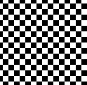
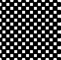
The tricky thing about dot gain is that the larger the amount of ink put down for a dot, the more gain results. So for a small dot - in an area of an image where the ink coverage is light - there will be little or no dot gain. In fact, it tends to go the other way. Really small dots of ink can be absorbed into the paper, and so they make a smaller spot than intended, resulting in areas that are too light. Also, for very large dots, although dot gain occurs, because the dot was large in the first place, the percentage change is not that high. It boils down to dot gain having the most visual effect at a dot size that would, if perfect, provide 50% grey.
Here's an example showing how a 50% screen can go to 70% as a result of the effect of dot gain:
WinImages F/x's dot gain correction, in the final analysis, involves lightening medium to fairly heavy areas of ink coverage. This tends to result in an image that will look "washed out" if you recombine the CMYK plates using the add as CMYK layer modes, but the dot gain at the printing press reverses the effect and you get a good final image this way, so don't be concerned if you see this effect. This only works correctly, of course, if you've got the right setting.
Also, as you might well imagine, the press, screens, inks and papers used can greatly affect how much dot gain is a factor for any one image or project. For instance, the greater the number of lines in the screen, the more dot gain is a factor. So this is definitely one of those issues that you want to keep aware of on a per-print-shop basis!
Because a CMYK color separation actualy isolates the inks - the four plates are literally used with four matching inks - even manual adjustments for ink coverage are really very easily made to the separated results. For instance, in WinImages F/x, you could use the Histogram or ChannelMap operators for custom adjustments, or even the Gamma operator for a "pre-cooked" curve that would do a good job. Or you could use the Scripting operator to create repeatable, precision custom results. But... making the correct adjustments - now, that is the trick!
Rather than trying to struggle through this manually, most people will be better off using the simple setting in the plate separations dialog. This controls a "knee" at the 50% intensity point that reduces the ink output to the percentage specified at the 50% point, and linearly returns to zero percent at both ends of the intensity range. No compensation is applied for dot loss, but dot gain may be adequately controlled with the correct setting.
First (of course!) talk to your print shop. They should be able to give you some figures. 7% gain in the midtones is a decent starting assumption if no one is willing to hazard a guess for you. If the resulting image is too dark in the midtones, increase the dot gain setting. If it is too light in the midtones, decrease the dot gain setting. A setting of zero is no dot gain. We should also point out that the 20% dot gain example above would usually be a very high value; you're more likely to see values under 10%. But with fine screens, you might even see more.
|
UCA is a process that adds cyan, magenta and yellow where black ink is present in a CMYK composition.
UCA is generally not desirable in offset printing. Furthermore, unless the dark areas are absolutely devoid of those ink colors (meaning the region must actually be greyscale in the first place), using UCA will almost certainly destroy the color balance of the region.
The idea of UCA is that adding the colored inks in order to replace the black inks changes the underlying black to a black that is brownish, and that, in the view of some folks, can improve the occassional photo. Generally speaking, for the vast majority of images and projects (sets of images) it is a terrible idea, and WinImages F/x does not support it at all. But - if you really want browns in the areas where the image is black, then use the color key modifier to limit application, and fill the darkest regions with the brown you want prior to separation.
Optimum halftone creation is a very tricky endeavor for the operator. It is intimately related to both the actual screening and the specific printing press in use, and your print shop is best qualified to perform both of these steps of the printing process. It is a fact that more low quality printed output results from improper halftoning than any other single step.
The plate separations output from WinImages F/x are ready for halftoning by the print shop. They contain pure ink density information.
Trapping is a process used to compensate for misregistration of the color plates in the printing press. This can cause gaps to appear between edges of areas that have colors that use different plates; if the cyan plate is a little off from the yellow plate, for instance, an image of the sun (yellow) in the sky (blue) the blue may overlap the yellow on one side and present a gap on the opposite side and create unintended ink mixing, or "mud."
You can, if absolutely necessary, compensate for this by blurring the edges of the sun and/or the sky in the specific color separation plate or plates after the separation has been created. In taking this approach, keep firmly in mind that the only places where you should try to compensate are where plates differ markedly from one another. Areas of continuous ink coverage don't need (and should not receive) any compensation even if the edges are sharp. Look for sharp transitions in color that cause one separation to suddenly pick up and another to leave off in ink coverage.
This is by far a better approach than "automatic" trap generation because trapping, by its very nature, reduces the quality of the actual image data, which (of course!) you don't want. It is worth noting that some print shops always seem to want traps, and others don't - and of course, the shop that doesn't need traps to get good results is the one to go with.
While trapping is presented by software that supports it as a means to "solve a problem" (plate misregistration) it does so always at the expense of the printed image quality. Problems such as hatching and muddy edges are typical (though unintended) results of trapping. We feel that the best approach is to solve the actual problem (misregistration) rather than introduce a new one (blurring plate edges where colors overlap) to solve the first.
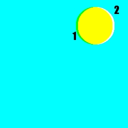 1 - Overlap caused by misregistration 2 - Gap caused by same misregistration Trapping would fill the gap at (2), but would also exacerbate the muddy edge created by the overlap at (1). A much better solution is to get the plate alignment fixed. Watch for this type of error in magazines and books; it is the mark of a shoddy and careless print process. |
| Quick Nav Bar | ||||||||
|---|---|---|---|---|---|---|---|---|
| << Previous | Contents |
Selection |
Op Index |
Parent | User Notes |
Index |
Glossary |
Next >> |
| WinImages F/x Manual Version 7, Revision 5, Level B |